A collection of design projects. Brand design here goes beyond logo, typography, and palette: it's a reading of the story a project needs to carry. Whether it comes from a private client, a company, or an institution, every project is meticulously adapted to the uniqueness of the client and their story.
Approdi
Brand Identity
Description
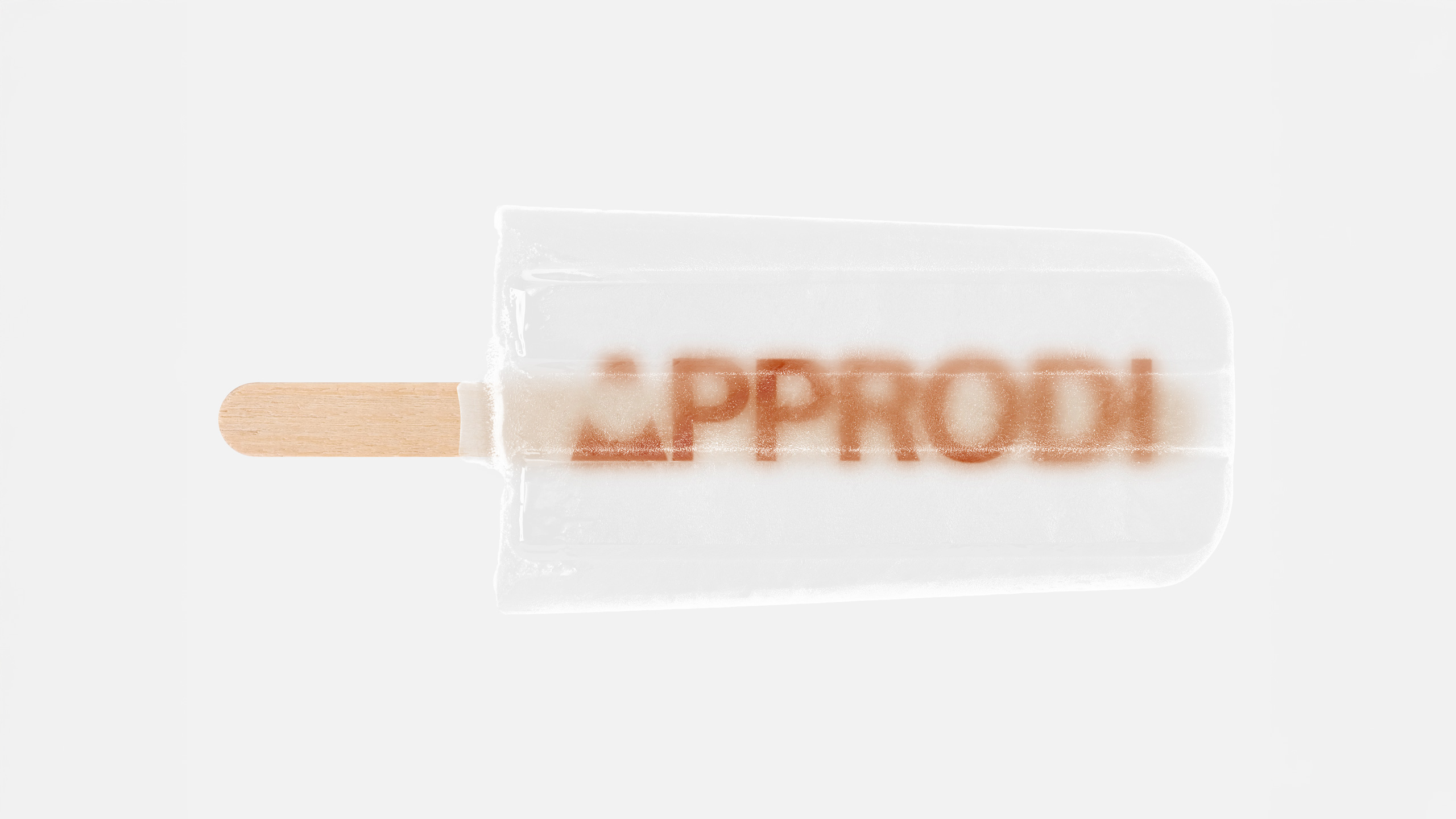
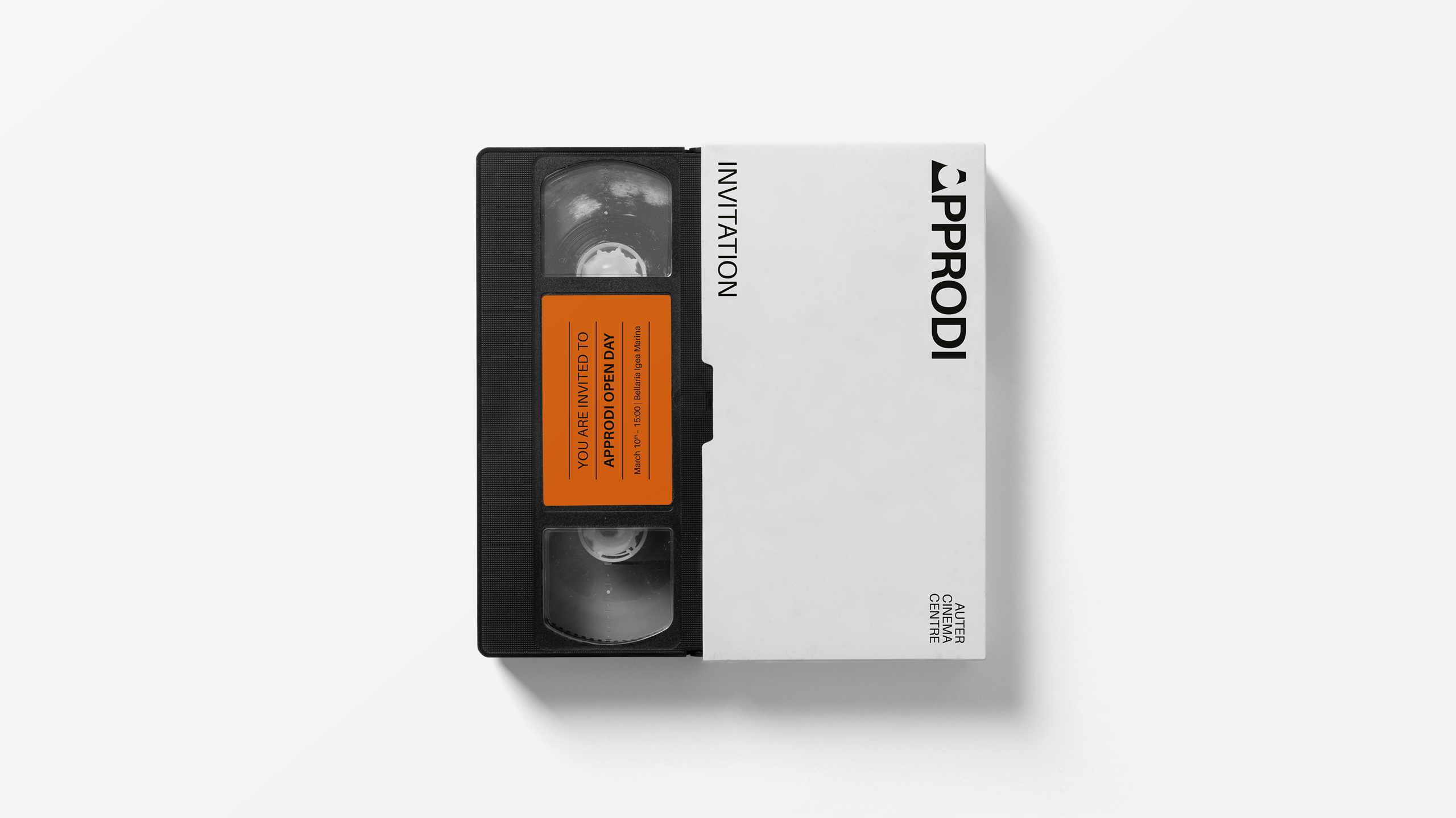
Approdi is the first center dedicated to auteur cinema in Italy, a unique space for research, education, and production in the world of moving images. Unlike traditional institutions, Approdi is not based in a major city but in Bellaria Igea Marina (Rimini), facing the open sea—an ideal setting for a project that embraces independence and creative freedom.
Founded in 2021 by Sergio Canneto, Elena Monti, Cesare Barbieri, and Cecilia Guagnano, Approdi is a space of growth and exchange, welcoming anyone passionate about cinema. The visual identity of Approdi is deeply connected to its surroundings, reflecting both the simplicity and richness of its territory. This region has given birth to visionary talents such as Federico Fellini and Dario Fo, shaping the Italian cinematic landscape.
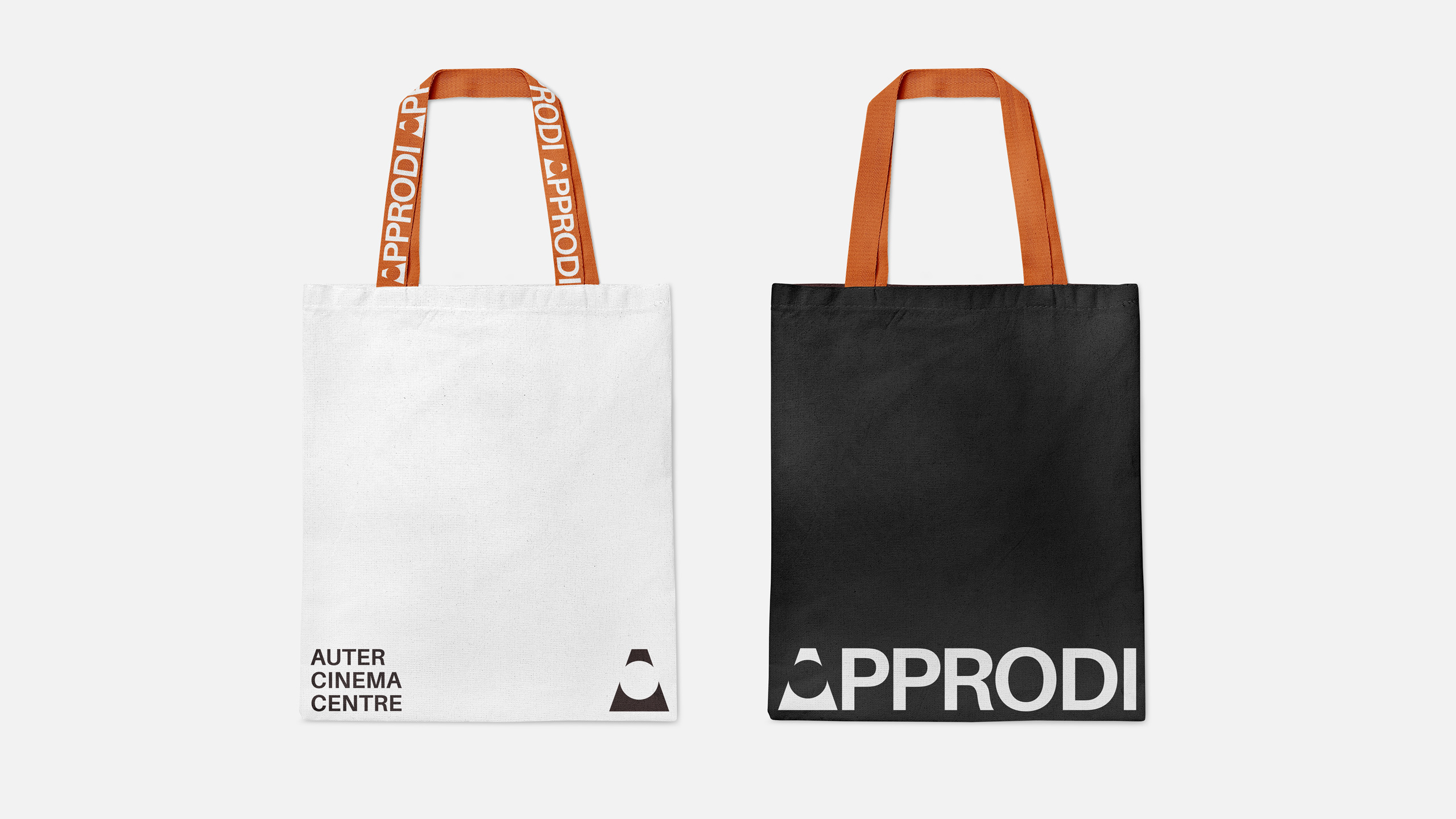
At the heart of Approdi's branding concept is the lighthouse—an emblem of guidance, exploration, and inspiration. It symbolizes the start-up’s mission to become a beacon for emerging talents while shedding new light on Italian auteur cinema. The identity blends tradition with a forward-looking vision, establishing Approdi as a landmark for the next generation of filmmakers.
Founded in 2021 by Sergio Canneto, Elena Monti, Cesare Barbieri, and Cecilia Guagnano, Approdi is a space of growth and exchange, welcoming anyone passionate about cinema. The visual identity of Approdi is deeply connected to its surroundings, reflecting both the simplicity and richness of its territory. This region has given birth to visionary talents such as Federico Fellini and Dario Fo, shaping the Italian cinematic landscape.
At the heart of Approdi's branding concept is the lighthouse—an emblem of guidance, exploration, and inspiration. It symbolizes the start-up’s mission to become a beacon for emerging talents while shedding new light on Italian auteur cinema. The identity blends tradition with a forward-looking vision, establishing Approdi as a landmark for the next generation of filmmakers.

Risografia
Website Experience
Description
The website was born less out of necessity than a shared vision. The pursuit and celebration of imperfection sits at the core of the aesthetic developed by Risografia, the collective founded by Enrico De Luigi and Walter Costa — and it mirrors principles central to my own artistic practice. The website followed as a direct consequence.
The experience was designed to break away from the visual conventions typically tied to printing services, because Risografia is far more than that. It is a itinerant collective that, through a unique risograph printing approach, collaborates with institutions, associations, designers and artists.


Nebula Dischi
Brand Identity
Description
In the heart of the Forlì province, Nebula Dischi is more than just a record store; it is the culmination of a family’s lifelong devotion to music. After decades of navigating the vibrant world of vinyl fairs, the founders decided to channel their expertise and passion into a physical sanctuary for audiophiles and casual listeners alike. For Nebula, music is a living entity that requires care and devotion. In an era dominated by the ephemeral nature of digital streaming, the brand advocates for a deeper connection. This project wasn’t conceived as a mere nostalgic look back, but as a way to enrich the "rhythm" of daily life—an invitation to slow down and appreciate the tangible soul of a record.
Moving away from traditional, cold corporate symbols, the brand identity centers around a character that functions more as a mascot than a logo. This choice was driven by the desire to build an emotional bond with the community—a recognizable face that evokes warmth, familiarity, and a touch of playfulness. By humanizing the brand, Nebula Dischi creates a visual anchor that stays with the customer long after they leave the shop, transforming a simple purchase into a lasting relationship.
To translate the "analog" essence of the shop into a cohesive visual language, the design system focuses on the inherent physicality of the medium. The use of bold, old-school typography mirrors the sturdy, unapologetic presence of a vintage vinyl sleeve, while image treatments are defined by a heavy use of grain and noise to recreate the grit and texture of traditional printing. This tactile atmosphere is further grounded by a color palette that intentionally avoids digital vibrancy, opting instead for a sophisticated mix of neutral tones and opaque, muted colors. The result is a brand identity that you can almost "feel"—an experience that honors the craft of the past while providing a contemporary home for the music of tomorrow.



IRD GN-z11
Sportswear Design
Description
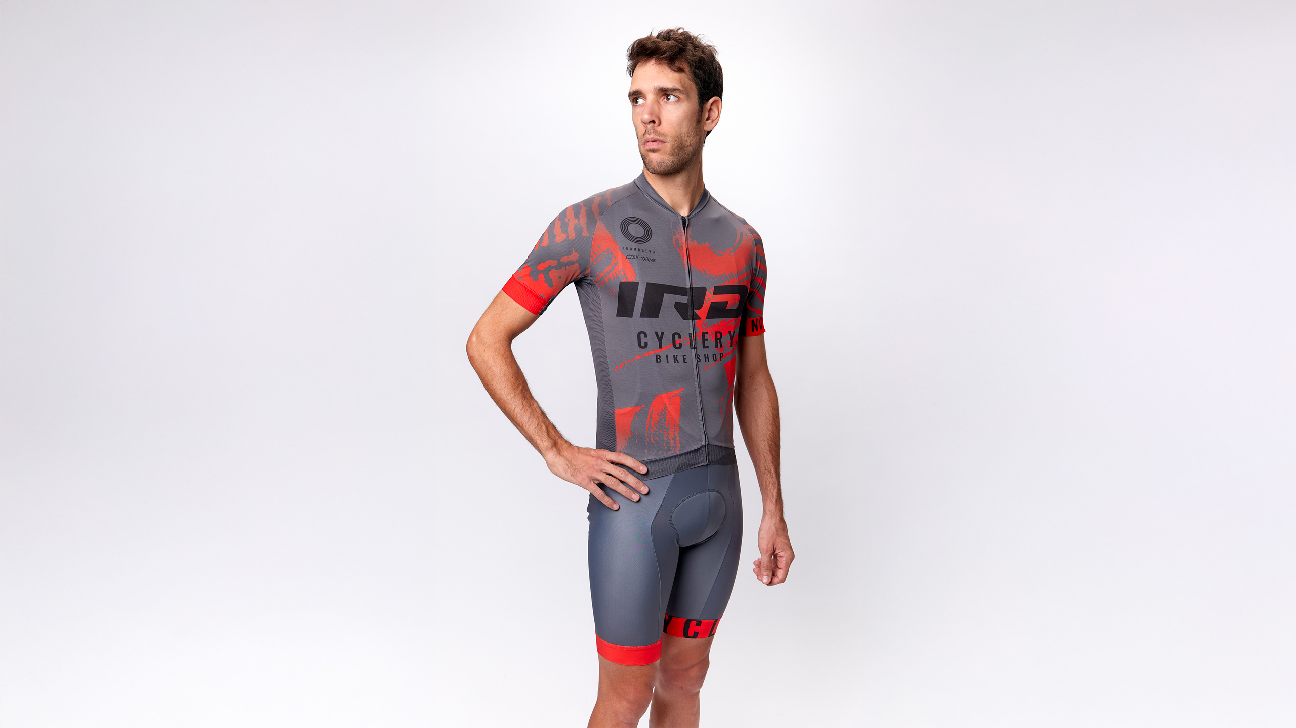
The GN-z11 project represents a visionary collaboration with IRD Squadra Corse, the Modena-based racing team renowned for its deep roots in fixed-gear culture and competitive criteriums. IRD has always promoted an inclusive vision of cycling that goes beyond the physical act of riding, embracing the diverse cultures and human experiences that orbit the sport. This desire to look and project oneself further led to the choice of the name GN-z11, inspired by the most distant galaxy known to man. It is a tribute to the brand's instinct to explore new frontiers and maintain a perspective that reaches far beyond the conventional boundaries of performance.
The creative process behind the kit is a bridge between tactile artistry and digital innovation. The design originated from physical abstract compositions created by hand using brushes, enamels, and acrylic paints. These raw, textured artworks were then scanned and meticulously manipulated in a digital environment to create a dynamic visual language that flows across the athlete’s body. The resulting aesthetic captures the essence of the cosmic inspiration while maintaining the grit of the racing world. The complete GN-z11 collection is designed to meet every technical need on the road, featuring a comprehensive range of garments including the jersey, bib shorts, gilet, and long sleeve jersey, complemented by essential accessories such as performance socks and a neck warmer.
GD STUDIO Srls – via Fiorenzuola 700, 47521 FC Cesena, IT – info@giacomodrudi.com – P. IVA 04860980400
© Giacomo Drudi. All Rights Reserved.